White Ash Glass Studio
A glass artist with a studio in the woods and no digital presence at all.
This community resists being sold to. The moment a website feels like a funnel, they disengage.
From the brand book, July 2026
We started with the town, not the logo.
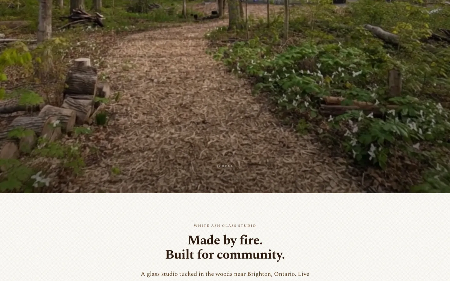
White Ash had real craft and nothing online: no website, and no reviews or hours on Google. Before any design, we studied the place: Brighton, Presqu'ile and the Prince Edward County corridor, how locals talk, what they trust, and what makes them tune out.
That research set the rules. No pop-ups. No funnel. Every call to action reads like an invitation to come see the studio, never a push to buy.
What we built
- Cultural and language researchLocal values and behaviors, words to use and words to avoid, tonal principles and tagline options.
- Brand book21 pages: story, positioning, six audiences, the Tree of Life logo, color, type, voice, photography and print.
- whiteashglass.comSeven pages: classes, experiences, gallery, the studio and glass, the founder and contact, with a working contact form.
- PrintA two-tier business card system, brochure and signage direction.
How it shipped
- 0 → 1From no web presence to a live site with classes, experiences and a gallery.
- 1 monthFrom finished brand book (July 16) to the refined live site (August 17).
- 0 pop-upsA deliberate choice, straight from the research.
The site does not have analytics set up yet, so we are not quoting traffic.